The idea
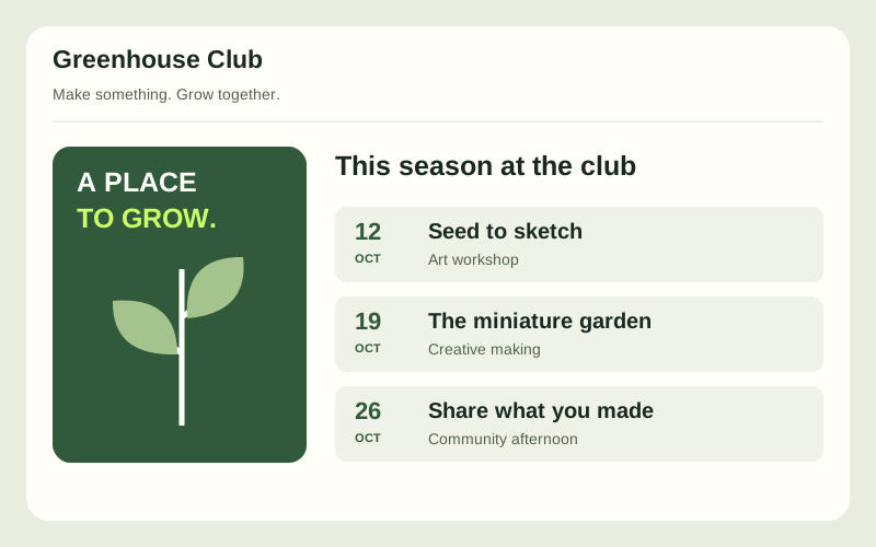
Help a visitor understand a fictional creative club, compare its events and prepare to attend. Build confidence through complete event information and consistent layouts, without pretending bookings are live.
See this learning levelWhat you will build
- Home, about, event listing and event detail pages using one consistent design system.
- Event cards with readable dates, locations, access information and clear detail links.
- Mobile navigation, visible keyboard focus and layouts tested with long titles and missing artwork.
How it fits together
Use static pages and shared CSS components for navigation, cards and event details. Define spacing, type and colour tokens. Any joining or booking area is explicitly a design proposal with no data submission.
Build milestones
Define the club
Write a fictional club brief and three complete event records. Sketch the route from discovery to event details.
Build the design system
Create navigation, cards, labels and page-width rules. Test each with realistic long content before composing pages.
Adapt the layouts
Use Grid and Flexbox to move from a phone layout to a wide-screen editorial composition. Keep the reading order logical.
Audit and refine
Check focus order, contrast, text resizing and event consistency. Record issues and show the improvements in a before-and-after review.
How you will know it works
- Every event card links to matching details with the same date and location.
- Navigation works with keyboard focus at mobile and desktop widths.
- Long event names and absent images do not overlap, truncate essential text or shift reading order.
What you will finish with
A multi-page responsive club site, a component reference and an accessibility review using fictional event content.
Take it further
Add a second visual theme using the same components and show that all contrast checks still pass.