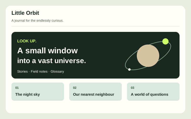
The idea
Introduce a favourite subject to a curious beginner. Little Orbit uses a fictional space journal as its design direction; learners can choose their own interest and verify factual content before publishing.
See this learning levelWhat you will build
- A home page that explains the topic and guides readers into three connected articles.
- Consistent navigation, meaningful image descriptions and a glossary of unfamiliar terms.
- A reusable colour and typography system that remains readable on phones.
How it fits together
Use static HTML pages with a shared stylesheet and locally stored images. Plan headings and links before styling. Keep an AI-assistance log showing a suggested change, your explanation and the check you used to accept or reject it.
Build milestones
Plan the reader journey
Choose an audience, outline three articles and sketch a sitemap with a clear next step from every page.
Write the structure
Build semantic pages with headings, paragraphs, lists and links. Add sources or credits where the content requires them.
Create the identity
Choose a restrained type and colour system. Build responsive image and text layouts without hiding essential content.
Review the reading experience
Check every link, read the site on a phone and navigate by keyboard. Revise confusing copy and explain the HTML and CSS you used.
How you will know it works
- Every page has a unique title, one main heading and a working route back home.
- Text stays readable at narrow widths and 200% zoom without horizontal scrolling.
- Images have useful alternatives or are marked decorative; generated content is reviewed before publication.
What you will finish with
A complete static interest website, sitemap, content credits and a short design rationale.
Take it further
Add a print stylesheet that makes the long-form articles easy to read on paper.